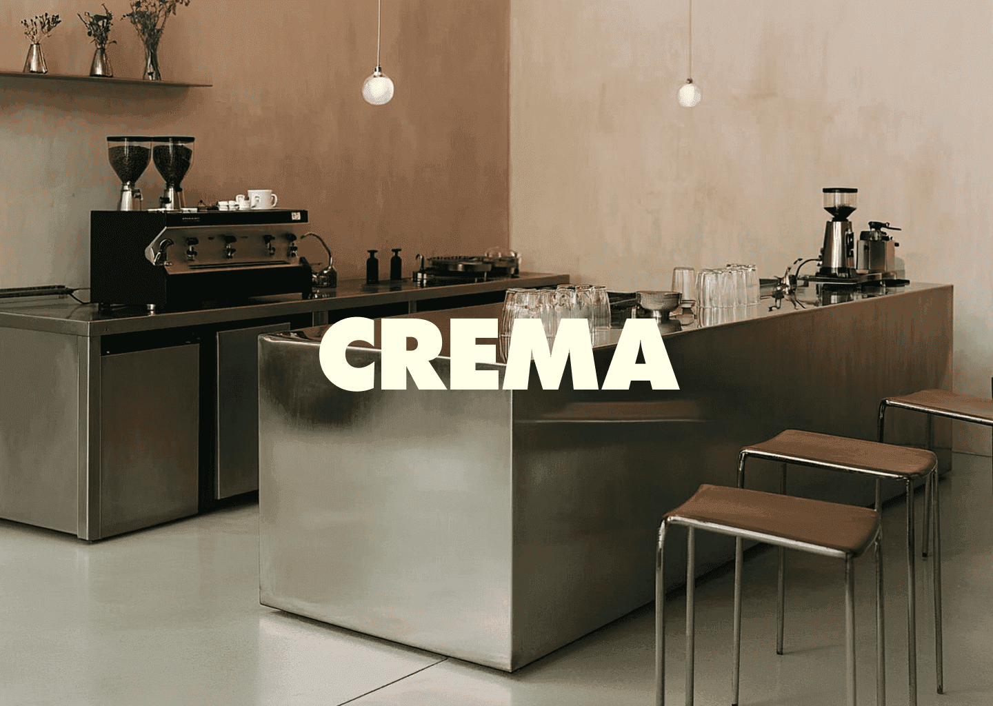
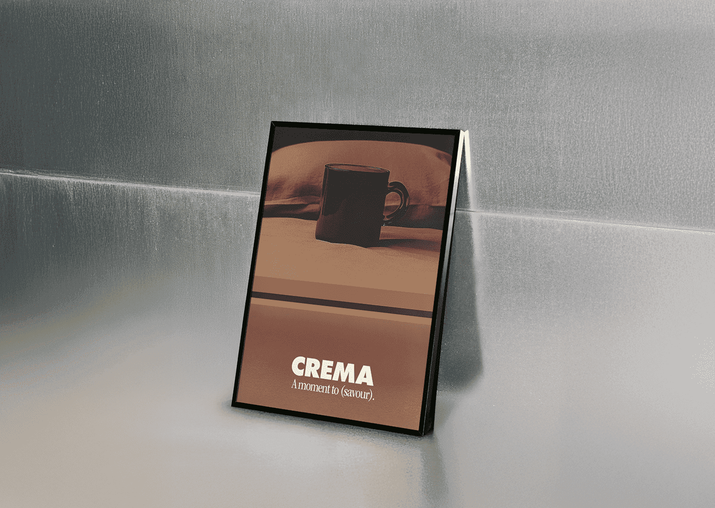
![](https://images.squarespace-cdn.com/content/v1/664158b92d08132cf849ff3f/363bd95a-6be5-413c-872d-8b3f54913cc0/Studio-Esens-Nusa-Logo-Colour-Branding.png)
Nusa
SCOPE Brand Strategy Brand Identity Packaging Collateral
YEAR 2024
Nusa, meaning Island/Archipelago in Indonesian, is more than just a sunscreen company. Crafting its brand identity was an absolute delight, with each element reflecting its core values.
With a market niche for sunscreen suitable for all skin complexities, developing the strategy and identity was a sweet exploration of art and shape, ensuring Nusa radiates as a beacon of inclusivity and sun safety.
Sunscreen that celebrates inclusivity and the carefree spirit of the 70s.
INDUSTRY Beauty & Wellness
Logo
The logo palette, with each letter of 'NUSA' boasting a different skin tone, is a vibrant ode to diversity and acceptance. The symbol itself, depicting an island with the sun rising, serves as a gentle reminder to prioritise sun protection.
![](https://images.squarespace-cdn.com/content/v1/664158b92d08132cf849ff3f/20ee7277-aa26-490f-9e04-82f50a2536e4/Nusa-background-palette-colour.jpg)
![](https://images.squarespace-cdn.com/content/v1/664158b92d08132cf849ff3f/6357fed1-4228-4524-82d1-15d159b0b5e4/nusa-packaging-mock-up.png)
Digital
In imagery, inclusivity shines through, capturing the laidback lifestyle of customers, whether they're catching waves or soaking up the sun.